Head
|
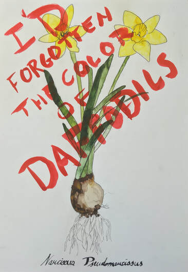
i'd forgotten the color of daffodils
pen and ink wash This piece makes a large reference to botanical drawings that were highly prevalent before photography became widespread. This work focuses on the comparison of perceptions of nature before the industrial revolution and today. The style in the botanical drawing refers to an older and more reverent and respectful perception of nature, while the text, its style, and its placement suggests the loss of nature, a lack of knowledge of nature, and an apathy about the environment. |
|
shades of white
paper, cardboard, and wood
This sculptural piece continues my focus on human interaction with nature and the environment. I've built what's almost a miniature theater with layered backdrops to really capture the human element. Rather than just focusing on human actions (like the contamination of nature), I choose to focus on human perception of nature and their actions - hence the theater. I think the very fact that the landscape is changeable adds to the weight of the message - in essence stating that human perception and interaction with nature is under our control.
Heart
|
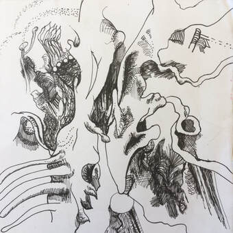
nightmare
Pen on cardstock This work is a continuation of a series that I began earlier this year. I've drawn intricate designs on these pieces in the efforts to create the illusion of form and depth, despite having no reference images for the pieces and no actual final form in mind. I think the results have been incredibly satisfying and actually quite good practice in shading forms in ink. In this piece, I tried to invoke more of a mood with my drawing rather than I have previously. While I've generally just followed my whim, this time I set out with the goal of creating a murkier and more ambiguous drawing (still full of form) to really represent a different kind of organic form. |
|
|
|
rolling
Linocut Print I've really enjoyed my work with linocut prints this year, and I wanted to continue it with this piece. As always, despite not engaging so much in my content as O've outlined it in the heart section, my work dealt with nature - in this case, a dung beetle. I combined by enjoyment of drawing and making prints of natural things with my interest in graphic design as well, and rather than creating a relatively realistic background, I decided that the best option and the cleanest option was to make stripes in the background behind the beetle. I'm also kind of intrigued by my own choice, because I have generally avoided drawing insects in the past, and instead have focused on mammals and larger animals. |
