|
Howardina Pindell: What Remains to Be Seen
Abstraction and Mark Making
2 Comments
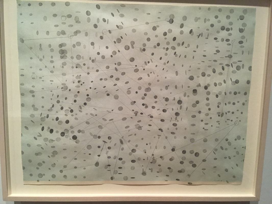
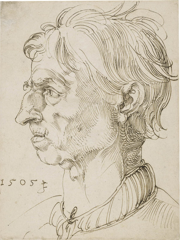
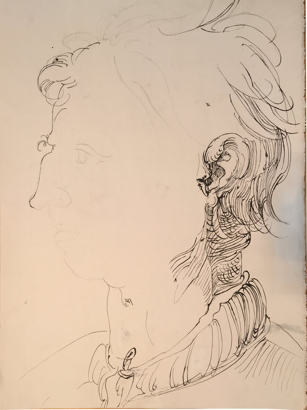
Here is the final (official) process post for this project. I put an enormous amount of effort into this drawing, and despite the extreme incompleteness of it, I was very satisfied with The parts I did accomplish. I copied every single line as exactly as I could, and while I can see errors and misplaced lines, the effect overall is very much the same as Dürer's. Looking back and forth between the two, they look really quite similar, and each major point - the spaces between major lines, thick blots of ink, areas of light and dark - pretty much lines up. Over the next couple weeks I want to continue to work on this and finish it up. I think I've done the majority of the most difficult part - the overlapping lines in the back of the neck and the hair - so the rest should go a little more smoothly. I'm satisfied with the part that I've done, and I would just like to see this project finished. I absolutely loved this lecture. I found it incredibly inspiring and I left it wanting to draw and think and learn more about it and so much else. Unfortunately, I missed the Lunchtime Lecture last year on Wabi-Sabi, which I was very disappointed about because I love Japanese art and design. At this lecture, however, it wasn't really an interest in the topic that drew me in, it was a more emotional connection. Wabi, Sabi, and Yugen made complete sense to me, and it felt somehow completely natural. I think without knowing it, I had almost adopted similar ideas of Aesthetics as the Japanese seem to have, and this presentation showed me how similar they really were. I also really resonated with Tanizaki's ideas and writing. I was extremely impressed with his capability to convey emotion and aesthetic interest through writing in a completely unique and new (to me at least) way. His essay seems much more powerful BECAUSE it is not a 'traditional essay' in the modern sense of the word. To me, the simple phrase "in praise of shadows" is the perfect summation of everything he says, describing elegance, beauty, simplicity, and tradition. His stress on shadows and darkness, as well as imperfection in the mechanized age felt instinctive and innate, and as soon as I looked at the images Amanda Adams showed, I understood. The one frustration I had was with defining Wabi, Sabi, and Yugen. These ideas are so ethereal and almost tempestuous in nature that they resist definition. Maybe in the Japanese language, these words have clearer meaning to the speakers, but in English, perhaps the less elegant language, they simply do not convey enough meaning and weight to be able to say that they do the ideas they represent justice. Wabi, Sabi, and Yugen are complicated concepts, but they feel native and natural and perfectly right. I found this video about Kintsugi, which is the repairing of damages that took on artistic value in Japanese art. Thus far, inking the Dürer copy has been successful but slow. I had some trouble at first with Dürer's mark due to the angle of the pen. Whenever I was trying to make a mark that was thicker or heavier at the top, the pen would catch due to the curve of his mark. In some of the pictures below you can see some of my practice. Probably the hardest part of this process is honestly just looking at the lines and figuring out where each line goes. There's such a high density of lines overlapping, especially in the part I worked on between the 4th and the 6th, and just seeing where they go is quite a challenge. Initially, I had been penciling in most lines as I went to make sure I got the proportions just right, but because that took such an excessive amount of time, I've moved away from that and have tried to just freehand most of the smaller, less important lines. It can be more frustrating because mistakes are permanent, but because there are so many of the lines, no mistakes will really stand out unless you compare the drawings at each line. However, I am very proud of the work I've done. Every single line (except one that I forgot and there isn't room to add it in) is in place, and overlapping with the same lines in the same places as the original. One more frustration of this project is the scale. This piece is massively bigger than the original, which is only 8.2 inches by 5.8 inches, so the width of the pen relative to the paper was much larger for Dürer. This essentially means that on my copy, there is much more white space relative to inked space because the pen is so thin. I've tried to fix this by going over lines multiple times to make them thicker, but it's still not quite right, and it changes the effect somewhat. Honestly, I really enjoyed the drawing of this piece. I was sick the first day we worked on these, so I started out a little behind and only got my paper set up with its 10x10 grid (maybe a little excessive) on the second day. However, that small grid made the drawing a lot easier to do and I think made it nearly impossible to have any major mistake in proportionality. I do have to make sure I strike a balance between making sure things are in the right place, and getting through the drawing to the next phase. However, overall, I am very happy with how the piece is going, and I like Albrecht Dürer even more now than I did before starting this. Unfortunately I don't have a picture from my first day of work, as it was only the grid that I finished. |
AuthorWrite something about yourself. No need to be fancy, just an overview. Archives
June 2019
Categories |
 RSS Feed
