|
This week I began work on my sculpture. Throughout the planning process, I knew I wanted to work with natural materials, and to really focus my content on the intersection of Humanity and Nature. I am especially interested in the question of how nature benefits humans, and what humans are doing to both destroy and conserve nature. As such, I really wanted to use a mixture of man-made or industrial materials and natural materials. My first idea was to essentially remake part of a tree branch out of wire, and to replace that section so it looked like one contiguous piece. I also thought about using multiple materials in multiple places on the same branch, maybe integrating epoxy resin casting or ceramic in addition to the wire. While I haven't quite yet made up my mind, I do intend to use the wire system that I had thought about in some element of the piece, so I spent some time this week figuring out how that could work. Initially, I used a very hard wire, which I liked because it provided the entire piece a greater stability and rigidity, however it quickly became clear that it was too difficult to work with. The next class, I tried out the same process (drilling diagonal holes through each end of the branch) and threading much more flexible wire back and forth between the pieces. This worked better, but looked quite shoddy - and really didn't give the effect I was looking for. However, then I twisted the two pieces of wood, causing the wire to twist itself into a much stronger and more rigid, and also much more visually appealing connection. I also tried wrapping a piece of wood with wire to get almost a spring, which I could use to bridge the gap between to sections. This worked pretty well, but just didn't give the structural integrity. I think the wire loops and eventually twisting the connection is going to work and look best in the long term. Of course, this example shown below is only my first try, and I plant to make the twisted connection much more uniform looking - demonstrating greater craftsmanship.
1 Comment
I've had a longstanding interest in photography and film, so I was really excited to see this Lecture. What I really didn't know about and was eager to learn about was her process for creating art, as my limited experience with film and photography hasn't really given me much of an opportunity to develop any kind of style or consistent process. I really enjoy photography, because it allows me to focus on the design and composition of a shot. I find that the clear unadulterated focus on the composition - rather than the execution of the piece - is freeing, and allows me to create work on a higher level. Freyer gave a lot of advice about being an art student and a student in general, which I found to be interesting and insightful. However, what I really was interested in was hearing about her own work. Something that I clearly hadn't realized was the amount of time and research that went into each of her films. I was amazed at how long she spent and how hard she worked at each and every film, and I was really impressed. I think that kind of research - maybe not to the same extent, but definitely some in order to gain a greater understanding of WHAT I'm photographing or filming, could be beneficial to my art. I think the other thing I got out of her lecture was the importance of playing around and exploring different things. I enjoyed a lot of different styles last year, and now I really want to work on developing a voice or a process. The fact that Freyer seems to be always filming, an then balancing the footage in editing, is really interesting and intriguing to me. I think that idea of consistently filming is important - because not only does it provide a constant creative outlet, but it lets you practice your skills with your chosen medium at all times. I think I'd like to make a goal for myself to start carrying around my camera more in order to take more practice photos, and force myself to be constantly thinking about art and what art I could make. I also found the brief technical bits about film and cameras very expensive, so here's a video talking about 16mm film, which Freyer used in her work: In the end, I have to admit, I am unsatisfied with the outcome of my piece. I think in certain areas I achieved the effect that I was looking for - with kind of murky edges and infinite variations in color - but unfortunately, there were too many areas where I wasn't able to get that effect. I think the materials were certainly a part - using acrylic on a prepared canvas is very different than using acrylic stains on raw canvas, and I do think that had a pretty large effect on the final product. I'm also not sure I'm completely happy with the composition. Honestly, it feels to similar to a Rothko, and I think I should have chosen a more experimental composition - maybe even turning the canvas sideways. In all, I wouldn't say that I'm unhappy with the outcome, However, I would definitely say that there are some areas that could really use some fixing. Finally, I am considering going over the entire painting with a matte medium. Right now, theres a lot of glare coming off the painting, especially with the fluorescent lighting, which makes it very difficult to see the variations in color. I think I'll go over the entire painting with a layer of matte medium next class, and it should make the piece more interesting, and the important parts too visible. My work on the practice paintings certainly inspired my work on the final painting. While the technique I experimented in my second painting was much closer to that which I used in the final, I think there are some important comparisons to be made with my first practice as well. The translucent brown and swirled glaze that I laid over most of the surface really inspired me to pay attention to color. I knew before the first painting that I was interested in color, but that experience made me realize the ability to control and manipulate color that was possible with acrylic paints. The second practice painting was largely an experimentation with materials. I was really trying to replicate the layered washes and glazes that color-field AbEx artists used, and in order to do that, I reversed the canvas. Unfortunately, the canvas didn't work too well, and the acrylic layers weren't dark or saturated enough to get the effect I was looking for. However, it did give me good practice with the color palette and composition that I was looking for.
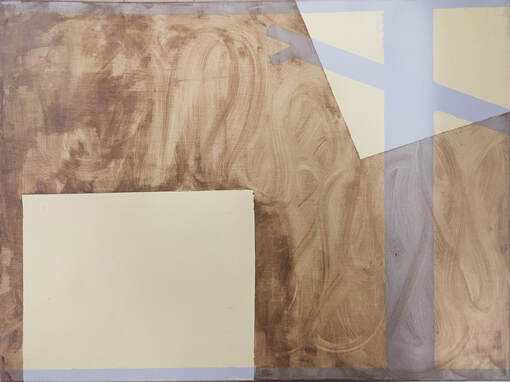
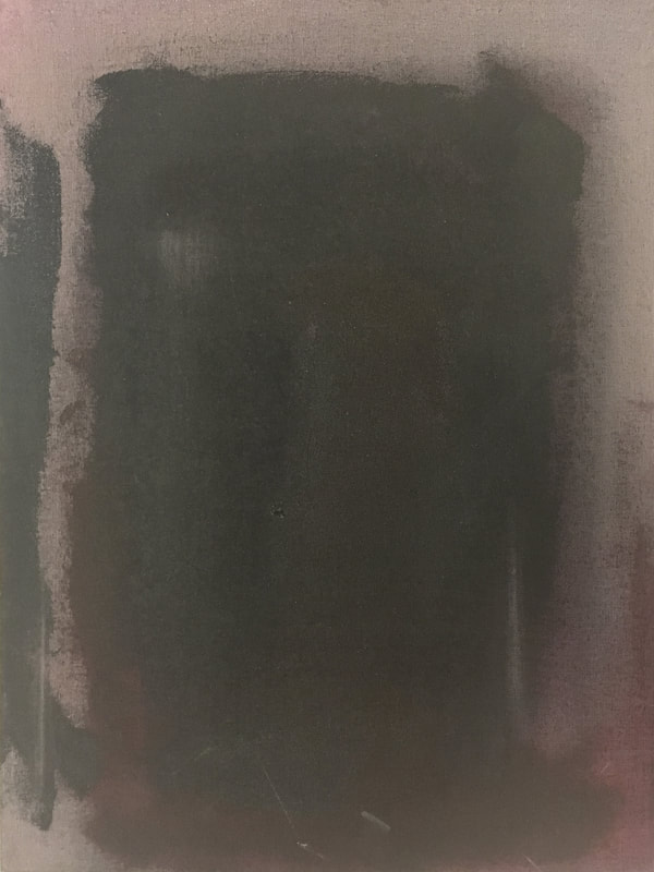
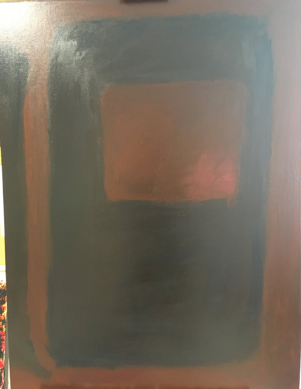
I'm pretty happy with how the composition turned out. I think the balance is all right, and although if I were to do this project again, I probably wouldn't keep the same composition, I don't mind this composition, and I think it is effective. I worked with some more red this week, and added less water to build up that color a little more. I really like the saturated colors that have resulted - it feels much deeper and like there is real space to almost interact with. It definitely needs more work along the edges, but I think I'm getting pretty close to finishing this piece. It may have gotten a little too uniform in color, so I'll try to work some variations back in. 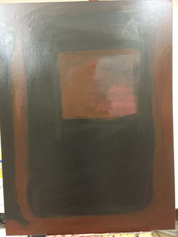 This week I struggled with composition. While I had some idea of what I wanted - I had really liked the black or dark red vertical bar on the side, which I copied from my practice painting, but I wasn't sure what I wanted to do for the middle section. I also knew I wanted a big, black, rectangular block in the middle with some hole cut out from the middle of it, but I wasn't sure of the orientation of the rectangle or the hole. I drew a bunch of sketches and thumbnails, and I even played around with turning the canvas sideways for a little while. I almost convinced myself that I wanted to turn the canvas, before I realized that I liked it the original way better. So, without knowing exactly where I was going, I started to paint the black bar on the left side. I was pretty happy with how that went, and the edges I got on that, so I decided to push forward on the design that seemed to make the most sense to me, and just felt right. So I went on with the painting, and then realized I was unsatisfied with it. I was no longer bothered by the darkness - I think that merely complements the subtlety - but now the shape in the front was too far removed from that ground. I really want those shapes and colors to blend together, almost as if the shapes in front are sinking into a sea of the reds. So at that point, I began to go back in, sometimes into the still wet black paint to bring in some red colors, but more with a pretty bright red over the bottom right hand corner. As I worked back and forth with the colors - pushing and pulling edges, I began to get the effect I was really looking for. I think the secret is really to not stress the work too much. Because the paint is opaque, it layers well, and nothing is completely permanent. I can just keep working at it until I reach the effect and result that I envision. 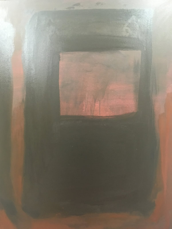 Firstly, my apologies for the extremely washed out picture - the room has some bright fluorescent bulbs that create a ton of glare.I made some progress this painting session, however, in some ways I think I regressed more than progressed. I started off by going back in over almost everything with a much darker "stain" (if I can call it that, as it doesn't really stain the canvas like it would on raw canvas). Unfortunately, I didn't watch this as closely as I should have, and it ended up dripping a bit and streaking in a way that I didn't like. To try to cover up the streaks, I went back again with more dark paint, which made the painting as a whole too dark in my opinion. While it may not align exactly with what I had in mind, I still really like the subtlety that I have created, and I think I can make it work quite well as I continue to work. 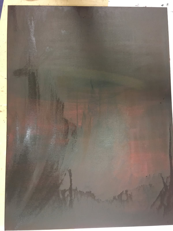 Here's my work on the first day of this project. At this point, I'm actually really happy with how its going. I am extremely nervous about actually starting works, and especially with something more permanent than pencil. However, I am really happy with this ground color that I've gone with. I think it allows for the depth and complexity in color and value that I'm really looking for, and when mixed aggressively with black like I've done in parts of this work, it creates a lot of interest and subtlety. I think I went in with the black a little too aggressively perhaps, and it made the work (so far) look like 2 separate panels instead of one continuously morphing segment. This shouldn't be a big deal to fix, however, and I'm looking forward to continuing on it. 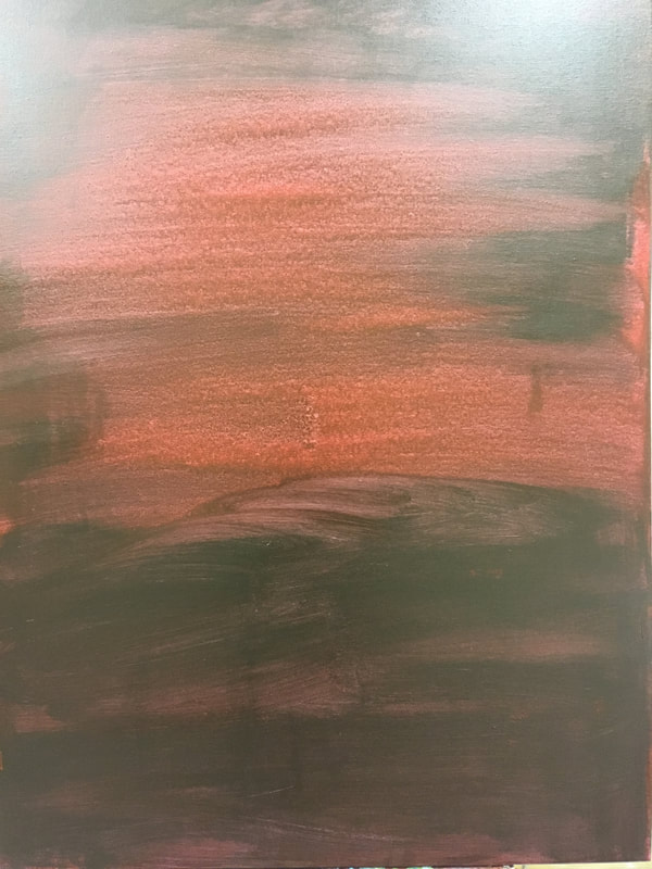
Questions:
Here are the sources I used and some other NON-MANDATORY materials - if you're interested. The video is a slideshow of about 300 of Rothko's works. http://www.markrothko.org https://www.moma.org https://www.phillipscollection.org https://www.guggenheim.org https://www.moma.org Play Page Inspiration
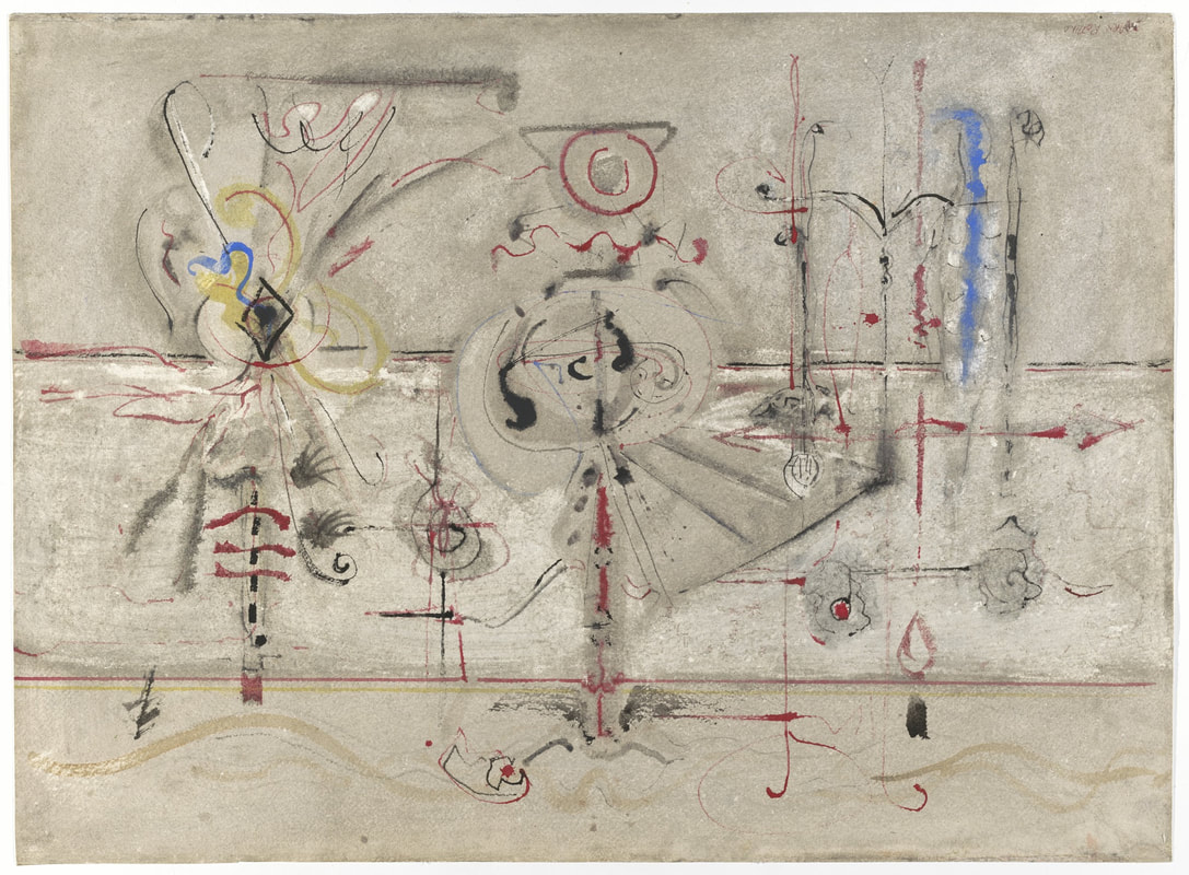
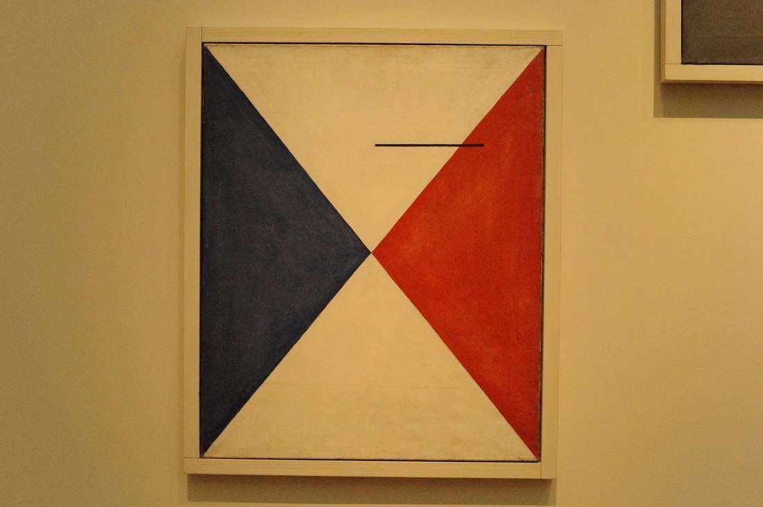
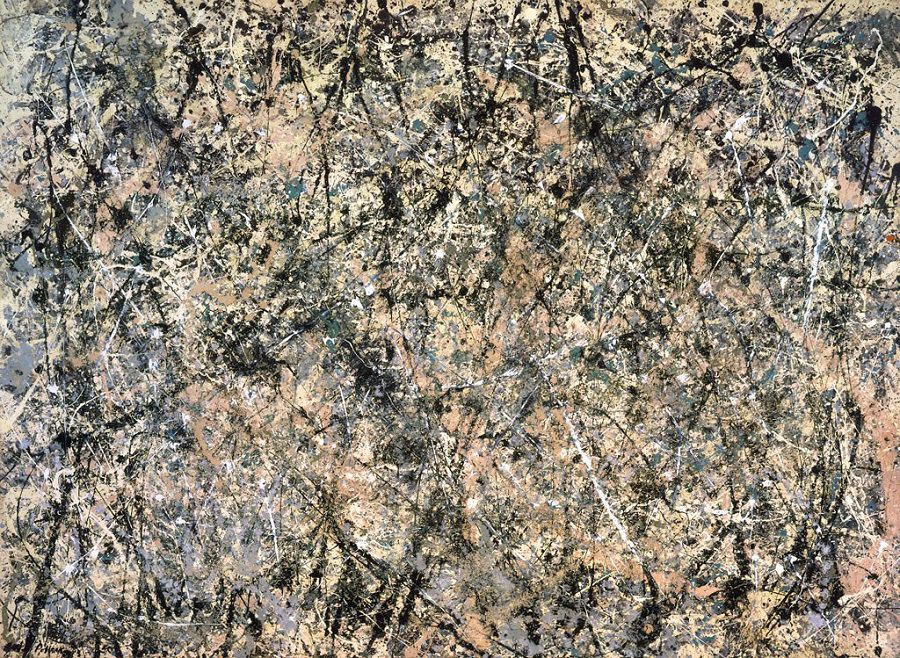
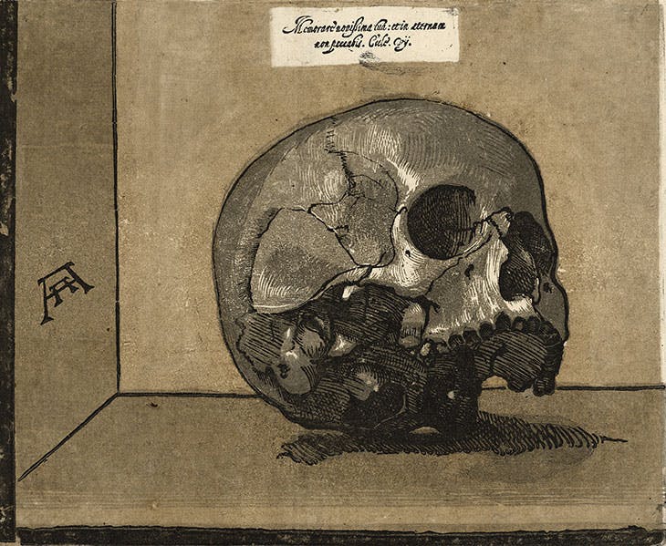
These works were especially intriguing to me as inspiration for play pages in part because of their variety. These works are all very different, making use of different materials to accomplish very different things. While both the Calder and the Pollock are non-objective, they are also very different, and work toward different goals. Calder makes much more use of color and pattern, before disrupting his symmetrical pattern with a thin black line. Pollock uses line and what is almost like a visual texture created by the paint to great effect. Andreani, on the other hand, while working 400 years earlier, shows great skill in woodcut, making effective use of value despite the more difficult medium. Abstract Expressionism
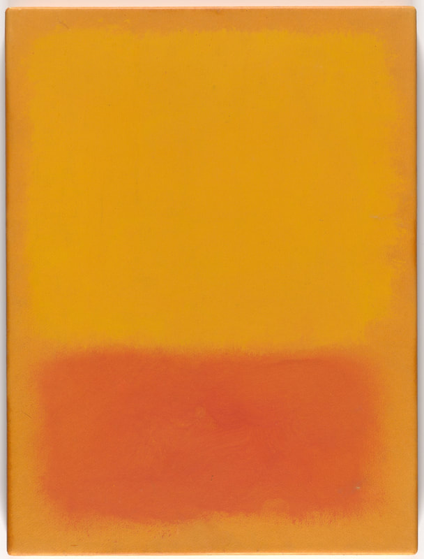
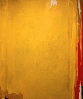
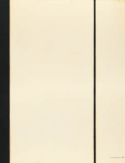
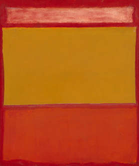
Here all the works I've shown are color-field Abstract Expressionism, but they all have very different characteristics. While Rothko and Still focus more on color, Newman almost exclusively uses shape and line. What I found most interesting was similarities and differences between the Still and the Rothko. Using almost identical color schemes, the artists still created massively different works that convey completely different emotions.
Interestingly, the artist's processes are not immediately obvious to the viewer. Rothko's work often looks slapdash - rushed even. The edges between colors aren't sharp and clear like in Newman's work, instead allowing seemingly random blending and areas of translucent. But, when you learn more about his process, it becomes clear that this was intentional. He designed his work this way and his painting accomplished this desire. The subtle variations of color as edges blend and layer are exactly what he wanted. I think to many people this Abstract Expressionist work is uninteresting because they don't understand the work and thought that goes into each piece. The greater understanding they have of the process and the intent of the artist, the more worthwhile I expect they will find the art. |
AuthorWrite something about yourself. No need to be fancy, just an overview. Archives
June 2019
Categories |
 RSS Feed
