ALEX BROENING
  • Home
  • About
  • Blog
  • Gallery
  • Head and Heart
  • Food and Baking

Blog

EXPERIENCE: VMFA Field Trip     //     11.19.2018

11/27/2018

2 Comments

 
Howardina Pindell: What Remains to Be Seen
Reflection - Serendipity and the Shape of Random
​   
Among Pindell's wide variety of works, spanning mediums, styles, and focuses there remains constants - both intangible and material. Her use of transparent materials such as vellum and acetate spans styles, as does her use of hole punches and photos. However, what I found to be the most interesting continuity throughout Pindell's work was her use of serendipity, and the idea of random. 
    To be honest, I have often hated the word "serendipity" or "serendipitous." I've thought of it as a pretentious cop-out for the lazy artist who puts too little thought in to their work, and expects the viewer to do the hard work of decoding and analyzing a piece of "art." To me, "serendipity" meant "chance," and "chance" meant laziness.
     However, Pindell has changed my mind - somewhat. I no longer deplore the concept of serendipity. I will, of course, still loudly assert that serendipity and chance are often used by the lazy artist in an attempt to make the viewer believe that some higher power is at work, or that because by mere chance (or really the rules of physics) a dash of paint happens to be shaped like a rabbit, the artist was conveying some meaning.
     Over the course of her career as an artist, Pindell consistently used serendipity, and never more so than in her works on acetate over a television. Not only did Pindell create the majority of the work before she incorporated chance, but when she did add an element of chance, she did so methodically and with intent. Pindell was very clear about what she wanted from a piece of art, and how the chance that she incorporated accentuated or added to the meaning. Pindell's art clearly shows the time and thought that went into each work. There were no truly random parts of her art. There was a chosen random, a curated random. Yes, there was random, but with intent.
Picture
Picture
Here you can see a continuity - in Pindell's use of transparent materials overlaying a background.
Picture
Picture
Here is another continuity of materials, this time of hole punches used in different ways on a surface.

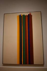
Abstraction and Mark Making
Picture
Early in the Morning, James Rosenquist, Oil on Canvas and Plastic, 1963, VMFA
Picture
Ocean Park No. 22, Richard Diebenkorn, Oil on Canvas, 1969, VMFA.
It's very difficult to draw a line in between Abstract art and non-objective art, however, I think the basic rule of representational vs not representational works quite well in general. I think that as long as an object in a painting or artwork can be consistently identified by different people, I think the work counts as abstract rather than non-objective. Once an object becomes so deformed or changed that it can no longer be recognizable by the majority of people, then it counts as non-objective. Works where there are definitely objects, but its unclear what those objects are, should be, in my opinion, classified as non-objective. The two works here are pretty clear. Rosenquist's work clearly has some representational aspects - the legs and the orange, while Diebenkorn's work has no recognizable objects, remaining clearly in the non-objective field.

Picture
Untitled, Mark Rorthko, Oil on Canvas, 1960, VMFA
The VMFA placard on Abstract Expressionist Art separated Abstract Expressionism into "Action Paintings" and "Color Field Paintings." Kooning and Pollock created examples of Action Painting, and Rothko and Newman are known for their Color Field Painting. Abstract expressionism really includes art made in the 40s and 50s that combined a host of global influences with a desire for expression through art without representation, and a focus on spontaneity. Rothko's work focuses on expression through the layering of colors, and the subtle variations that painting with thin layers creates in the finished work. 

Picture
Untitled, Frank Kline, Commercial Oil Based Paint on Canvas, 1955, VMFA.
Picture
Claustral, Morris Louis, Oil on Canvas, 1961, VMFA.
Picture
Synopsis of a Battle, Cy Twombly, Commercial Oil Based Paint and Wax Crayon on Canvas, 1968, VMFA.
The first work I've chosen is one by Frank Kline. Its really clear how these marks were made - quickly (though not without thought) and with what feels like a sense of urgency. they were made quickly with a large brush in straight lines - or maybe even a paint roller. Morris's work shows a much more slow and patient work. While it still has a feeling of action, you can almost see the slow vertical movements that it took to complete these overlapping colors. Finally, the Twombly work has a massive amount of motion and energy to it, with scribbled diagrams and numbers, indicating an almost frantic process. 

Picture
Lemons, Donald Sultan, Latex Paint, Plaster, Butyl Rubber on Vinyl tile over Masonite, 1984, VMFA.
Picture
17th Stage, Keith Noland, Acrylic on Canvas, 1964, VMFA.
Picture
Isis Ardor, Jules Olitski, Acrylic on Canvas, 1962, VMFA.
     Donald Sultan's Lemons has a very closed composition, looking down at the lemons without any cropping. In fact, it almost creates a triangular composition, somewhat similar to old religious art. Sultan also uses color and contrast to emphasize the lemons, and really pull the lemons off of the background and away from the bowl under them. He also completely excludes form from his lemons, making them just a flat color that adds the the contrast between the lemons and the more realistically rendered bowl.
     Noland's work, 17th stage has almost a flipped version of Sultan's composition, with an upside down triangle occupying the canvas. Here Noland uses repetition and pattern to emphasize the shape, directing the eye downward toward the point of the triangle. This work focuses on the elements of shape and color, using those almost exclusively. There's clearly a sense of motion caused by the repeating pattern - almost a driving force.
     Finally, Olitski's piece, Isis Ardor, has a more circular composition, radiating out from an off-centered lopsided circle. Like the others, this piece also makes use of color and shape and contrast between colors, however, the composition is very different. Unlike the others, its cropped by the frame, drawing the viewer into the painting, rather than allowing them to spectate from afar. I find the irregular circles somewhat unsettling, but I think they make the composition as a whole more interesting and gives the piece more motion. 
2 Comments
Rylan Karjane
11/28/2018 11:25:44 am

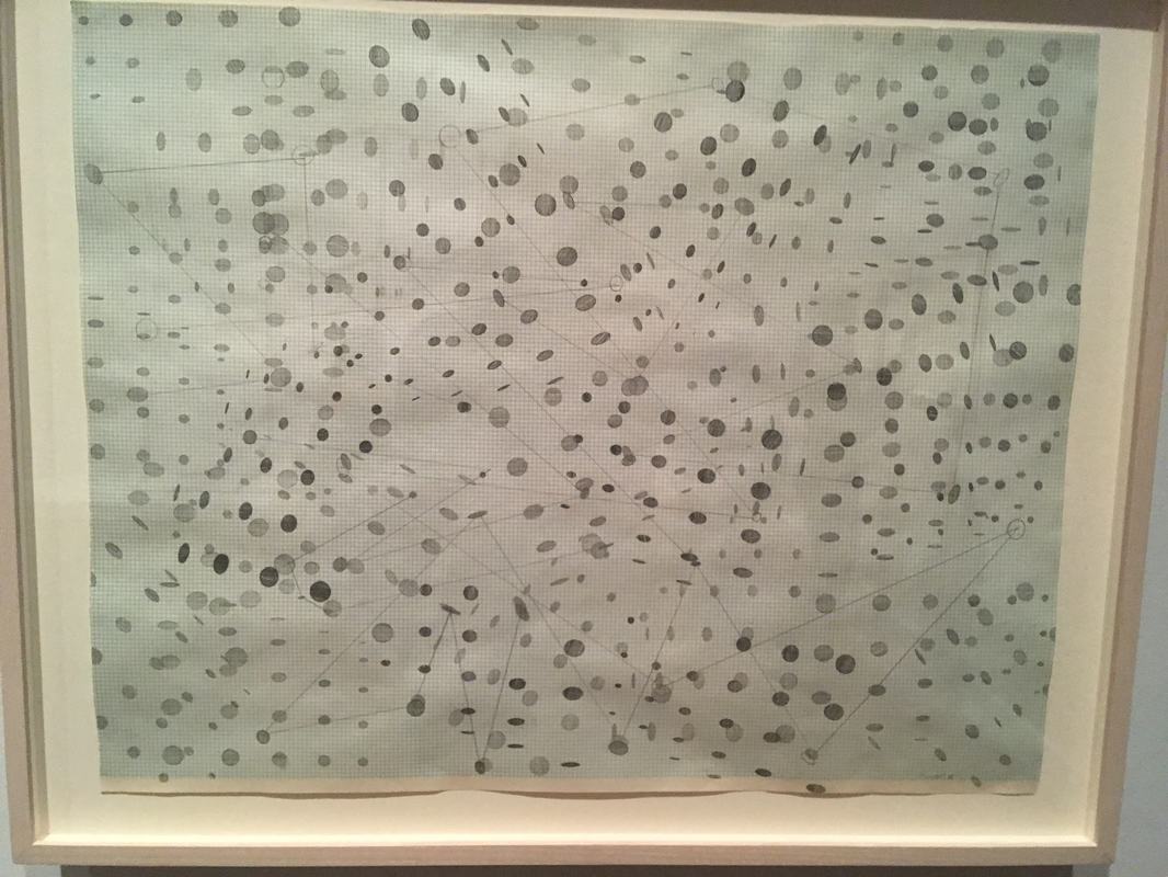
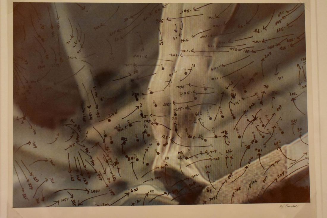
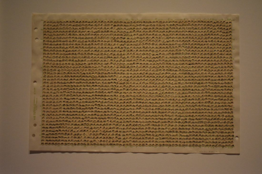
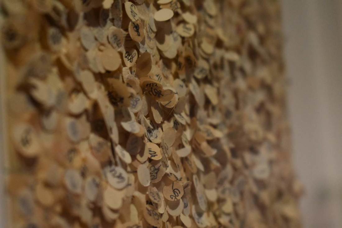
What you said about serendipity and how you feel it is a term lazy artists use to pass off the hard thinking onto the viewer really resonated with me. I enjoyed your interpretation an viewing of her work and I especially loved " Yes, there was random, but with intent." You are very eloquent and purposeful with your words and I admire that.

Reply
MM
11/29/2018 09:25:17 am

So....don't hate me... but it was serendipitous that I paired you and Rylan!!! The paring was random, pretty much, but I did pair students who did/did not attend the field trip, in order to support your level of experience. I think it worked out well that the two of you could continue to reflect on the element of chance - and the definition of laziness/skill (lack thereof). You said "However, Pindell has changed my mind - somewhat." - I'm excited about that! And to re-quote what Rylan responded to - "There were no truly random parts of her art. There was a chosen random, a curated random. Yes, there was random, but with intent." Awesome. The rest of your post was equally thorough, thoughtful, and filled with evidence of great learning and experience. Beautiful work!

Reply


Leave a Reply.

    Author

    Write something about yourself. No need to be fancy, just an overview.

    Archives

    June 2019
    May 2019
    April 2019
    March 2019
    February 2019
    January 2019
    December 2018
    November 2018
    October 2018

    Categories

    All
    Awareness
    Experience
    Process

    RSS Feed

Powered by Create your own unique website with customizable templates.
  • Home
  • About
  • Blog
  • Gallery
  • Head and Heart
  • Food and Baking