ALEX BROENING
  • Home
  • About
  • Blog
  • Gallery
  • Head and Heart
  • Food and Baking

Blog

Experience: Lunchtime Lecture - John Freyer

5/19/2019

0 Comments

 
Picture
The Lunchtime Lecture with John Freyer was really enjoyable and interesting - perhaps more so than any other Lunchtime Lecture that I've been to. Freyer seemed like an immensely motivated and creative person, and I was impressed by his openness to the audience. Knowing little about social practice art, I was intrigued by his work, and his various collaborations. I think previously in my mind I had separated social practice art from other more "artistic" types of art, but Freyer's lecture really changed how I saw that kind of work. He described the intent and content and meaning of his art projects in much the same way as someone could describe the content of a painting or drawing. That really resonated with me, and made me recognize the importance and value that social practice art has, partly because of the inherent interaction with people and partly because of the uniqueness of it. While Social Practice Art hasn't really been something I've thought about, I'm beginning to think it could be something interesting to explore and experiment with.
Freyer's Website: Freyer

0 Comments

Experience: Try-Me Gallery - 4.8.2019

5/19/2019

0 Comments

 
Picture
"Afterimage." Vincent Lamouroux. Aluminum tubing, paint, fluorescent lights. 2009. 64 3/16" x 181 7/8" x 98 7/16". Try-Me Gallery.
Picture
"Children's Dress." Chiharu Shiota. Steel, wool thread, paint, child's cotton dress. 2011. 27 1/2" x 17 3/4" x 17 3/4". Try-Me Gallery.
Picture
"Exposed Painting Blue Lake." Callum Innes. Oil on linen. 2013. 96 3/8" x 93 1/8". Try-Me Gallery.
Visiting the Try-Me Gallery was really different than most of the other field trips we've been on. The collection was much smaller than that of the VMFA, and even though we usually only look at a small part of the collection of a museum, having the contents curated and displayed so carefully was a different experience. The fact that each piece had been bought and chosen to fit into the gallery as a whole gave each piece a new meaning relative to the works around it. There were certainly some pieces there that I did not like, but many more that I really did like, and many which inspired me.
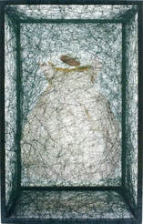
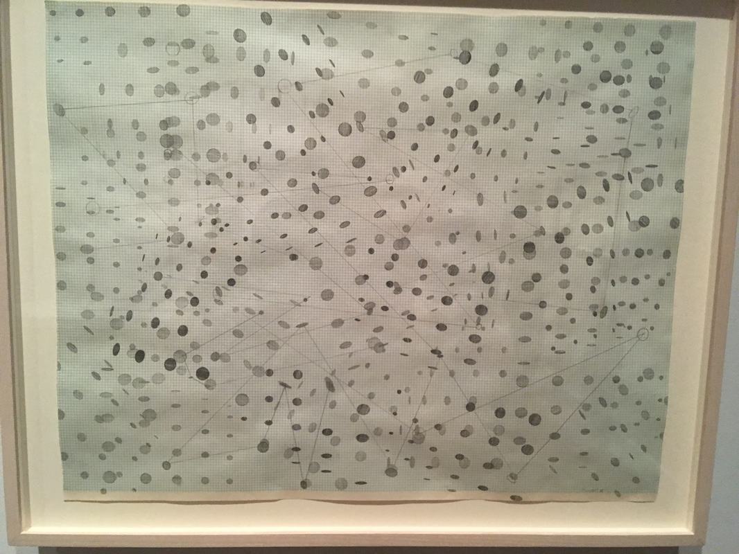
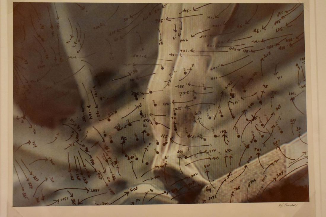
I think one of the things that I was most impressed by was the craftsmanship - especially of the sculptural works. Of course all professional artists make use of good craftsmanship, but the level of perfection and attention to detail was really astounding to me, especially having worked some with sculpture and being able to appreciate the difficulty of maintaining good craftsmanship in three dimensions. 
In addition, I was especially inspired by Chiharu Shiota and her wide variety of works. I'd like to look into her more and into her use of thread and yarn. It seems like that style or technique might be applicable to my work too.
Chiharu Shiota's Website
0 Comments

Experience: Sasha Waters Freyer - 2/20/2019

2/28/2019

2 Comments

 
I've had a longstanding interest in photography and film, so I was really excited to see this Lecture. What I really didn't know about and was eager to learn about was her process for creating art, as my limited experience with film and photography hasn't really given me much of an opportunity to develop any kind of style or consistent process. I really enjoy photography, because it allows me to focus on the design and composition of a shot. I find that the clear unadulterated focus on the composition - rather than the execution of the piece - is freeing, and allows me to create work on a higher level. 
Freyer gave a lot of advice about being an art student and a student in general, which I found to be interesting and insightful. However, what I really was interested in was hearing about her own work. Something that I clearly hadn't realized was the amount of time and research that went into each of her films. I was amazed at how long she spent and how hard she worked at each and every film, and I was really impressed. I think that kind of research - maybe not to the same extent, but definitely some in order to gain a greater understanding of WHAT I'm photographing or filming, could be beneficial to my art. 
I think the other thing I got out of her lecture was the importance of playing around and exploring different things. I enjoyed a lot of different styles last year, and now I really want to work on developing a voice or a process. The fact that Freyer seems to be always filming, an then balancing the footage in editing, is really interesting and intriguing to me. I think that idea of consistently filming is important  - because not only does it provide a constant creative outlet, but it lets you practice your skills with your chosen medium at all times. I think I'd like to make a goal for myself to start carrying around my camera more in order to take more practice photos, and force myself to be constantly thinking about art and what art I could make.
I also found the brief technical bits about film and cameras very expensive, so here's a video talking about 16mm film, which Freyer used in her work:
​
2 Comments

EXPERIENCE: VMFA Field Trip     //     11.19.2018

11/27/2018

2 Comments

 
Howardina Pindell: What Remains to Be Seen
Reflection - Serendipity and the Shape of Random
​   
Among Pindell's wide variety of works, spanning mediums, styles, and focuses there remains constants - both intangible and material. Her use of transparent materials such as vellum and acetate spans styles, as does her use of hole punches and photos. However, what I found to be the most interesting continuity throughout Pindell's work was her use of serendipity, and the idea of random. 
    To be honest, I have often hated the word "serendipity" or "serendipitous." I've thought of it as a pretentious cop-out for the lazy artist who puts too little thought in to their work, and expects the viewer to do the hard work of decoding and analyzing a piece of "art." To me, "serendipity" meant "chance," and "chance" meant laziness.
     However, Pindell has changed my mind - somewhat. I no longer deplore the concept of serendipity. I will, of course, still loudly assert that serendipity and chance are often used by the lazy artist in an attempt to make the viewer believe that some higher power is at work, or that because by mere chance (or really the rules of physics) a dash of paint happens to be shaped like a rabbit, the artist was conveying some meaning.
     Over the course of her career as an artist, Pindell consistently used serendipity, and never more so than in her works on acetate over a television. Not only did Pindell create the majority of the work before she incorporated chance, but when she did add an element of chance, she did so methodically and with intent. Pindell was very clear about what she wanted from a piece of art, and how the chance that she incorporated accentuated or added to the meaning. Pindell's art clearly shows the time and thought that went into each work. There were no truly random parts of her art. There was a chosen random, a curated random. Yes, there was random, but with intent.
Picture
Picture
Here you can see a continuity - in Pindell's use of transparent materials overlaying a background.
Picture
Picture
Here is another continuity of materials, this time of hole punches used in different ways on a surface.

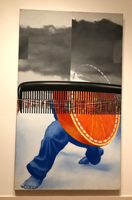
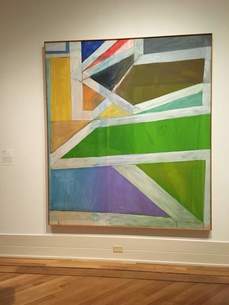
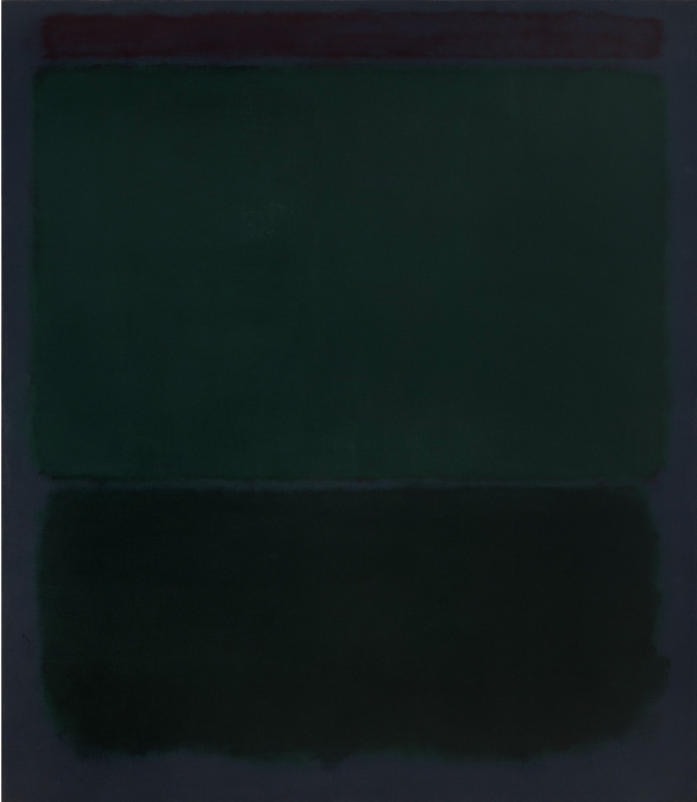
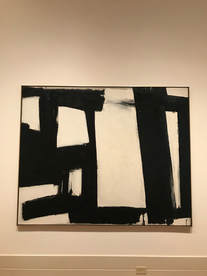
Abstraction and Mark Making
Picture
Early in the Morning, James Rosenquist, Oil on Canvas and Plastic, 1963, VMFA
Picture
Ocean Park No. 22, Richard Diebenkorn, Oil on Canvas, 1969, VMFA.
It's very difficult to draw a line in between Abstract art and non-objective art, however, I think the basic rule of representational vs not representational works quite well in general. I think that as long as an object in a painting or artwork can be consistently identified by different people, I think the work counts as abstract rather than non-objective. Once an object becomes so deformed or changed that it can no longer be recognizable by the majority of people, then it counts as non-objective. Works where there are definitely objects, but its unclear what those objects are, should be, in my opinion, classified as non-objective. The two works here are pretty clear. Rosenquist's work clearly has some representational aspects - the legs and the orange, while Diebenkorn's work has no recognizable objects, remaining clearly in the non-objective field.

Picture
Untitled, Mark Rorthko, Oil on Canvas, 1960, VMFA
The VMFA placard on Abstract Expressionist Art separated Abstract Expressionism into "Action Paintings" and "Color Field Paintings." Kooning and Pollock created examples of Action Painting, and Rothko and Newman are known for their Color Field Painting. Abstract expressionism really includes art made in the 40s and 50s that combined a host of global influences with a desire for expression through art without representation, and a focus on spontaneity. Rothko's work focuses on expression through the layering of colors, and the subtle variations that painting with thin layers creates in the finished work. 

Picture
Untitled, Frank Kline, Commercial Oil Based Paint on Canvas, 1955, VMFA.
Picture
Claustral, Morris Louis, Oil on Canvas, 1961, VMFA.
Picture
Synopsis of a Battle, Cy Twombly, Commercial Oil Based Paint and Wax Crayon on Canvas, 1968, VMFA.
The first work I've chosen is one by Frank Kline. Its really clear how these marks were made - quickly (though not without thought) and with what feels like a sense of urgency. they were made quickly with a large brush in straight lines - or maybe even a paint roller. Morris's work shows a much more slow and patient work. While it still has a feeling of action, you can almost see the slow vertical movements that it took to complete these overlapping colors. Finally, the Twombly work has a massive amount of motion and energy to it, with scribbled diagrams and numbers, indicating an almost frantic process. 

Picture
Lemons, Donald Sultan, Latex Paint, Plaster, Butyl Rubber on Vinyl tile over Masonite, 1984, VMFA.
Picture
17th Stage, Keith Noland, Acrylic on Canvas, 1964, VMFA.
Picture
Isis Ardor, Jules Olitski, Acrylic on Canvas, 1962, VMFA.
     Donald Sultan's Lemons has a very closed composition, looking down at the lemons without any cropping. In fact, it almost creates a triangular composition, somewhat similar to old religious art. Sultan also uses color and contrast to emphasize the lemons, and really pull the lemons off of the background and away from the bowl under them. He also completely excludes form from his lemons, making them just a flat color that adds the the contrast between the lemons and the more realistically rendered bowl.
     Noland's work, 17th stage has almost a flipped version of Sultan's composition, with an upside down triangle occupying the canvas. Here Noland uses repetition and pattern to emphasize the shape, directing the eye downward toward the point of the triangle. This work focuses on the elements of shape and color, using those almost exclusively. There's clearly a sense of motion caused by the repeating pattern - almost a driving force.
     Finally, Olitski's piece, Isis Ardor, has a more circular composition, radiating out from an off-centered lopsided circle. Like the others, this piece also makes use of color and shape and contrast between colors, however, the composition is very different. Unlike the others, its cropped by the frame, drawing the viewer into the painting, rather than allowing them to spectate from afar. I find the irregular circles somewhat unsettling, but I think they make the composition as a whole more interesting and gives the piece more motion. 
2 Comments

Experience: Amanda Adams and Japanese Aesthetics

11/7/2018

1 Comment

 
I absolutely loved this lecture. I found it incredibly inspiring and I left it wanting to draw and think and learn more about it and so much else. 
Unfortunately, I missed the Lunchtime Lecture last year on Wabi-Sabi, which I was very disappointed about because I love Japanese art and design. 
At this lecture, however, it wasn't really an interest in the topic that drew me in, it was a more emotional connection. Wabi, Sabi, and Yugen made complete sense to me, and it felt somehow completely natural. I think without knowing it, I had almost adopted similar ideas of Aesthetics as the Japanese seem to have, and this presentation showed me how similar they really were.
I also really resonated with Tanizaki's ideas and writing. I was extremely impressed with his capability to convey emotion and aesthetic interest through writing in a completely unique and new (to me at least) way. His essay seems much more powerful BECAUSE it is not a 'traditional essay' in the modern sense of the word. To me, the simple phrase "in praise of shadows" is the perfect summation of everything he says, describing elegance, beauty, simplicity, and tradition. His stress on shadows and darkness, as well as imperfection in the mechanized age felt instinctive and innate, and as soon as I looked at the images Amanda Adams showed, I understood.
The one frustration I had was with defining Wabi, Sabi, and Yugen. These ideas are so ethereal and almost tempestuous in nature that they resist definition. Maybe in the Japanese language, these words have clearer meaning to the speakers, but in English, perhaps the less elegant language, they simply do not convey enough meaning and weight to be able to say that they do the ideas they represent justice.
Wabi, Sabi, and Yugen are complicated concepts, but they feel native and natural and perfectly right.

I found this video about Kintsugi, which is the repairing of damages that took on artistic value in Japanese art.
1 Comment

    Author

    Write something about yourself. No need to be fancy, just an overview.

    Archives

    June 2019
    May 2019
    April 2019
    March 2019
    February 2019
    January 2019
    December 2018
    November 2018
    October 2018

    Categories

    All
    Awareness
    Experience
    Process

    RSS Feed

Powered by Create your own unique website with customizable templates.
  • Home
  • About
  • Blog
  • Gallery
  • Head and Heart
  • Food and Baking