Play Page Inspiration
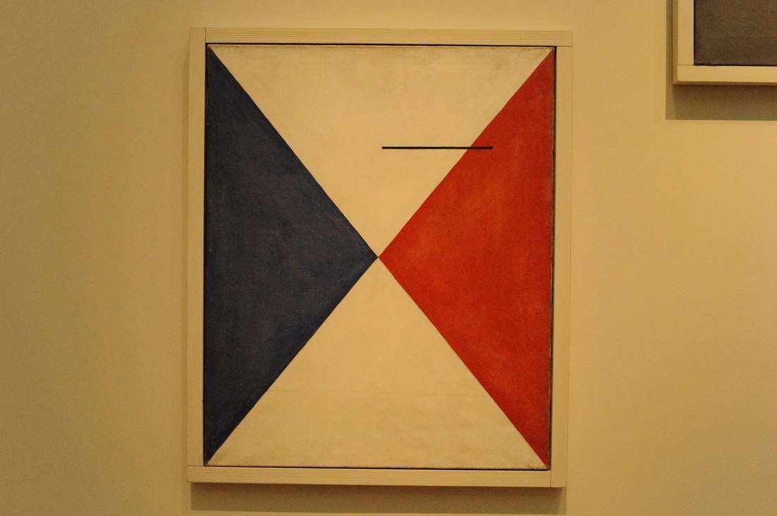
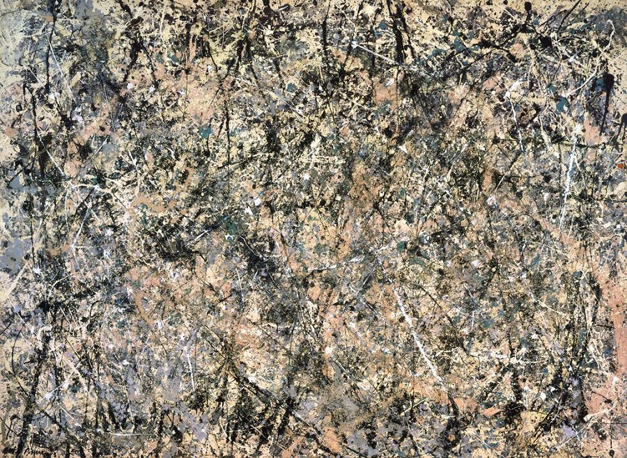
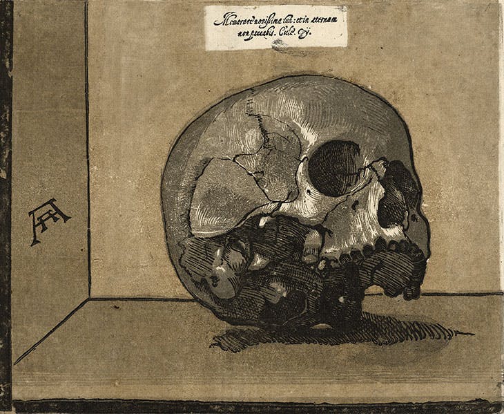
These works were especially intriguing to me as inspiration for play pages in part because of their variety. These works are all very different, making use of different materials to accomplish very different things. While both the Calder and the Pollock are non-objective, they are also very different, and work toward different goals. Calder makes much more use of color and pattern, before disrupting his symmetrical pattern with a thin black line. Pollock uses line and what is almost like a visual texture created by the paint to great effect. Andreani, on the other hand, while working 400 years earlier, shows great skill in woodcut, making effective use of value despite the more difficult medium. Abstract Expressionism
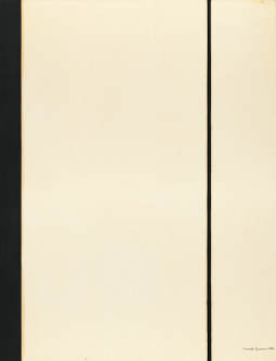
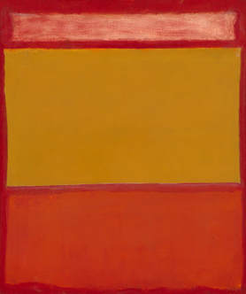
Here all the works I've shown are color-field Abstract Expressionism, but they all have very different characteristics. While Rothko and Still focus more on color, Newman almost exclusively uses shape and line. What I found most interesting was similarities and differences between the Still and the Rothko. Using almost identical color schemes, the artists still created massively different works that convey completely different emotions.
Interestingly, the artist's processes are not immediately obvious to the viewer. Rothko's work often looks slapdash - rushed even. The edges between colors aren't sharp and clear like in Newman's work, instead allowing seemingly random blending and areas of translucent. But, when you learn more about his process, it becomes clear that this was intentional. He designed his work this way and his painting accomplished this desire. The subtle variations of color as edges blend and layer are exactly what he wanted. I think to many people this Abstract Expressionist work is uninteresting because they don't understand the work and thought that goes into each piece. The greater understanding they have of the process and the intent of the artist, the more worthwhile I expect they will find the art.
1 Comment
After the work I did last time I got really upset with the whole piece and didn't work on it for a good long while. Deadlines are motivating however... I finished up working on the shirt, hand, and arm, and I was actually pretty happy with how I did on those sections. I thought the marks I made looked better than anywhere else on the piece, and even where there wasn't a clear mark to copy from Dürer's piece I managed to make something that resembled his mark. It made me feel a lot better to be working on it again. I also tried to be more bold with the lines and the line quality, especially in the hair, and I think that helped to give it form and a distinct look. Overall, I'm pretty happy with parts of the work, however, overall, I don't really like it. I'm very glad I did it, and I certainly learned some lessons from the experience. This started of decently enough, I think. I was pretty happy with how it was going, even though I looked a lot angrier than I did in the photograph.I was decently happy with how the face had gone, and even though I didn't like the whole eye area at first, it grew on me. However, then I started shading the face. This was a step I was really nervous about, because it was a lot of white space to fill and I wasn't really sure how to proceed. I started with the jaw and the shadow behind it, and that went pretty well, so I decided to just block off the highlights and go for it. That was a mistake. I over-did it on the face. I have multiple problems with the marks I made. First of all, I made too many marks. I was too narrowly focused on individual areas, and couldn't see the whole picture.I also made to many sections of overlapping shading, which made the whole face much darker than it should have been. Honestly, I probably should have stuck with where I was in the first picture. My other mistake was in the mouth and nose region. For some reason I had a really difficult time being able to tell if the mouth looked right in pencil when the rest was in pen, and I inked the mouth too soon. The mouth turned out really badly, and in trying to fix it I made the whole area much too dark. I've made a whole lot of progress and overall I'm pretty satisfied with how its going. I think it looks pretty nice, and in some places Dürer's mark really comes through. However, there are certainly parts that I'm very unhappy with. I think I really messed up on my arm. The mark I have there really looks nothing like Dürer's, so I'm definitely going to go back and see if I can make it better somehow. I made the back of the nose curve back toward the front much more than I initially intended to, however, there's not a lot I can do about that now. Another area that I'm having difficulty with is the hair. My hair is a lot longer than the hair in Dürer's drawing, which makes it a lot harder to copy the mark. The hair in Dürer's work has a lot of curve to it, which mine really can't do as it just falls straight down. I am extremely happy with the ear however. I think not only does it look pretty good, but I think I did a good job of copying Dürer's mark. That's probably my favorite part of this piece for the moment. I worked on the drawing next. To be honest it was ridiculously easy, and although I know parts of it are still a little off, I think overall it turned out pretty accurately. It was also really quick - it took almost no time at all. I guess part of that is because I'm not drawing the individual strands of hair like I did for the Old Master Copy. I think that as I start to add ink I will sketch boxes for areas to be hatched or filled in the same way, and that should make for an easier process and more accurate marks. I started this off with an idea I had really late at night. This composition I thought of really resonated with me, and I felt like it reflected something of my personality. I took that first picture with my computer webcam, and although you can't see it, I had to reach my left arm under and across my right arm to hold my computer out far enough - it was quite the feat of contortion. The top of my head and most of my hand were cut off in this first picture, so later I had my brother take some versions that included my whole head. That's where the second two pictures came from. I did some cropping to get those to where I wanted them to be. Then I did some roundabout and inefficient photoshop magic to get evenly spaced grid lines (the rectangles make a 10x10 grid) and saved it. I liked the composition and angle of the second photo less, but the shadows and features were better, so I'll use that as a second reference photo to accentuate depth when I ink the details and hatching. When it got to drawing the grid, I realized I didn't have a yardstick at home, and so I used a string taped to the table to mark points on the paper that I could then connect with a regular 1 foot ruler (credit to Raina for the idea). The drawing started off pretty well despite my doing it late at night. I find the 10x10 grid really helps with accuracy, because it lets me judge how far between two points a contour line intersects a gridline. I can mark those points and just connect them with the right curve in the line. The mouth currently is not at all accurate, so my next step is going to be to fix that. While the 10x10 grid that I do is initially extremely difficult because of the precision and accuracy and math that I insist on, it makes the whole drawing process so much easier for me, and in my mind is totally worth it for the greater accuracy it gives me in copying an image. If I do it well, there shouldn't be any gap for judgement - it should always be clear where the "right" line should go, and if something is off, it should be clear in how it's wrong. |
AuthorWrite something about yourself. No need to be fancy, just an overview. Archives
June 2019
Categories |
 RSS Feed
